Don’t assume that clients don’t care if the electricians they’re considering have bad websites. The modern customer is going to find their electrician through the internet. If you want to be the contractor they choose, you’re have to understand the importance of allowing your website to make a great first impression. A good website should be easy to understand, informative and attention grabbing—preferably in that order. Let’s take a look at some of the websites that do it right.
Trademark Electric
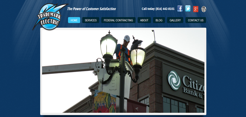
Trademark Electric is the perfect choice for the first website on our list. It’s simple, so you won’t have trouble pulling off something similar if you think your own electrician website needs a makeover. Just about everything is used well here. The logo is bright and noticeable, helping visitors understand instantly that they’ve come to the right place. After that, it’s really easy for them to find the page they want as soon as possible with the intuitive navigation options. The home page takes advantage of bright, relevant pictures to keep customers on the page. The laser-focused content provides good information without looking intimidating or distracting.
J-Five Electric
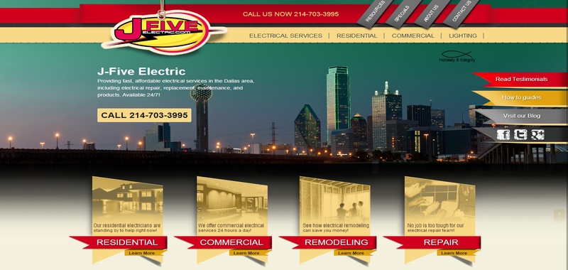
J-Five Electric out of Dallas gets many of the same things right as Trademark Electric, but this website uses a very different philosophy when it comes to content. Each service area is simple to find, but at the same time, tons of information can be found on the main page. This isn’t a problem because the information is well-labelled and broken up, so customers can still move through it quickly without wasting time on anything they don’t need to know. Now that you understand how either model of content can work, you’ll have an easier time implementing it on your own electrician website.
SME Inc.
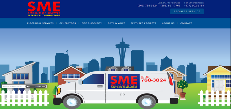
SME Inc. of Seattle has handled the image game better than most of the competition. The large custom image that covers the homepage is very effective branding, right off the bat. If you’re looking for a little more visual investment, there is a row of attractive images directly underneath and still more images to pull you through the rest of the content. It’s unlikely that even dedicated customers will bother to read all of the content on this page, but it’s out-of-the-way enough that no one will be scared off.
New-Com Inc
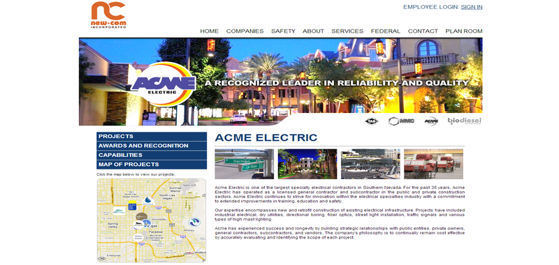
New-Com out of Los Vegas is another just-the-basics site that looks great. This website is very image-dominated, which is always a good strategy when it comes to modern audiences. The colors used here—yellow and blue—are one of the most popular color combinations for movie posters because of how effectively they draw attention when used together. All the websites we’ve looked at so far have had great pictures, but none has so well made every image consistent with the overall design.
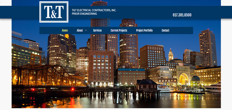
T&T
Sometimes, it’s good to focus the look of your website around a very specific goal. All of the previous websites were open for business to most customers, but this one is built around attracting one type of business in particular. The pictures and the style make it clear that this is a company that handles “big” jobs. In addition to the great pictures that feature massive lighting accomplishments, the narrow copy also establishes the exact kind of work they do. This website could have been built to ge
t more calls, but this style is going to guarantee that they calls they get are more likely to be good matches.
Last Updated By: Rochelle Sanchirico
Field Service Automation
Service Solutions
Last modified: January 16, 2018


 kcelectrician.net
 jfiveelectric.com
 smeincofseattle.com
 nclasvegas.com/Acme
 tt-electric.com
